Member-only story
In Defense of Pie Charts, and Why You Shouldn’t Use Them
In the data visualization community, I’m probably best known for experimental projects…for data art, for particle systems inspired by Chemistry and Physics, for audio analysis and mapping, for sharing what I’ve learned while migrating D3 projects to D3.V4.
So why am I writing about pie charts? Because it’s always a good idea to revisit the basics, every so often…and to question our assumptions about those basics.
Developing a data visualization is more than just data structures and algorithms. It’s more than code libraries and tools. It’s important to make time and step away from the code…to understand and follow best practices in data visualization.
For as long as I can remember, I’ve repeated and followed the standard mantra of data visualization: “don’t ever use pie charts”. Why? Well, most of the time they’re just not readable. It’s about how we perceive area, and angles, and more.
But are all pie charts unreadable? Aren’t there any good times to use one? Well, during dinner conversation at a data visualization conference (Tapestry), my assumptions about pie charts were pleasantly challenged. I was genuinely surprised to hear that there actually a few use cases that pie charts are really great for.
I’ll just show a couple that I found interesting.

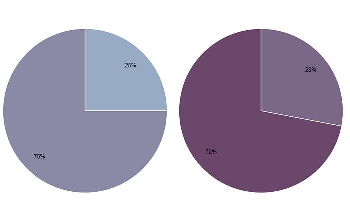
It’s all about perceiving certain angles, rather than area (which we’re not very good at). We’re able to easily see that 28% is definitely not the same as 25%. So, if we’re monitoring something that should be 25%, a pie chart can help us quickly see if ‘something’s off’. However, we might not be able to tell if it’s 28% and not 27%.

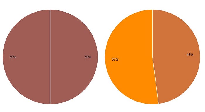
Same goes for 50%. It’s clear when the dividing line is not straight, and this shows us that the portions are not quite even. Again, we’re not really comparing area. It’s the straightness of the line that we are relying on.
If we look at the same data in a stacked bar chart, it’s not as intuitive. Which of the two sets has a 75:25 split? Yes, annotations and labels would help, but the pie chart does a better…